Barbara Jacobs
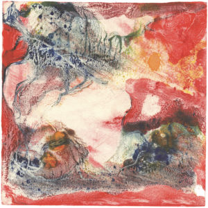
Breathless_Monotype: Oil based Ink - Black and White.
Unframed: 8" x 12". Black and White series 2026
Long-Range View_ Monotype: Oil based Ink - Black and White. Unframed: 12" x 8". Black and White series 2026
Green Tree: Monotype using soy-based inks on plexiglass plate. 8"x 10" unframed.
Ancient Mists Series: #1 - SUNSET REFLECTIONS_Layered Monotype: Soy-based Inks on linoleum plate, 5.5" x 13.25" unframed size - 2022
Ancient Mists Series: #4 - TIMELESS MOON_Layered Monotype: Soy-based Inks on linoleum plate, 5.5" x 13.25" unframed size - 2022
Swimming in Space_Monotype: OIl based Ink - Black and White. Unframed: 12" x 8". Black and White series 2026
Galaxy Series: Rainbow Dimensions. Monotype: Soy-based Inks on plexiglass plate, then made as mirror image with digital manipulation. 10"x18"unframed size
Green Windows: Layered Monotype: Soy-based Inks on linoleum plate, 8"x10" unframed.
Queen of Cups-3_Layered Monoprint based on linoleum cut image. One in a series. 8" x 10". Shown unmounted. Final will be Mounted on wood cradle with protective topcoat.
Ancient Mists Series: #2 -MORNING MIST_Layered Monotype: Soy-based Inks on linoleum plate, 5.5" x 13.25" unframed size - 2022
Color is key in exploring the relationships of time and space, shapes and scale…near and far; color and texture come through non-representational subject matter in a variety of media. ‘Environmental color’—how we’re affected by color and related shapes in our physical spaces, and ways of developing and communicating with color—has been prevalent in my own personal artwork, as well at the core of my professional architectural color design work over the past 30 years.
Inspiration comes from many sources, including the materials themselves. I’m inspired by immersion in a physical process that often leads to image, form, and concept development. As the subject matter of any piece evolves—whether intentional at the outset or more intuitively, as the result of the process—I tend to work in series of pieces that may even move from one medium to another as the inspiration and processes develop.
Within the area of monotypes, I enjoy using with oil stick, or soy-based ink + additional materials and photography, plus digital art combined with physical print works in layered processes. When in art school, my favorite subjects were in lithography and copper plate etching. While those materials are not practical for me to explore now, I enjoy the similar feeling that comes from seeing the types of images that are possible with new media. New ideas are always on the horizon.
My artwork derives from many years working with color in the built environment combined with many years’ experience creating and installing murals and surface finishes, including ethnic design processes of indigenous peoples and their print processes. It interests me that the deep involvement I’ve had in those frameworks over the past 40+ years is coming into my personal artwork from a different angle.
--Inspiration, process, and themes--
Landscape and landforms, architecture, history/culture, natural and human phenomena, and interpretations of being in and observing time and space in myriad dimensions are among the many subjects I find intriguing. I continue to explore the recurring concept of “windows” as a lens through which we experience color/texture and personal elements. I enjoy working in series, so whether in a physical exhibit, or among the online gallery images, you’ll see some connection between either a few or many pieces done in a particular style or medium. Some will be more “colorful,” while others will be in tints of black-and-white with small color inclusions. I’m not tied to any one medium or subject but enjoy myriad explorations, even including line drawings of both semi-representational and highly imaginative subjects that I might develop in various materials.
Regardless of media I'm working with, layering elements is important for my own process and experience and also for inviting the viewer to share in that experience and create his or her own story around it. Elements of whimsey often are part of that invitation.
Originally from Minnesota, Barbara moved from Boston to Sebastopol in Fall, 2015. An artist well-known nationally for his paintings, sculpture, and large stained-glass work in public spaces, her father, William Saltzman, offered immersion in the art-and-color-centric environment that created lasting influence. Barbara’s formal artistic education includes the Academia di Belle Arti in Florence, Italy; the University of California, Berkeley, where she studied with Adja Yunkers and David Hockney; and the University of Minnesota, where she received her Bachelor of Arts in painting and printmaking.
Prior to 2015, raising a large family was Barbara’s main focus.
• 1984-2015: developed a business creating design-related products and installing custom surface designs, wall finishes, and murals for residential and commercial clients in the Boston area.
• 1996-1990: taught seminars on “textile design of indigenous peoples” to selected high school students, via grants from the Massachusetts Council on the Arts. Her articles and interviews on specialty finishes and color use in the built environment appeared in a variety of shelter and trade publications.
Barbara has shown at many fine locations in the area, including featured-artist and juried exhibitions. Details on her web site.
Favorites: Reading, cooking, playing fiddle. Time with local family and friends.
Recent Comments